Designing for all: bridging the clinic accessibility gap
The Problem
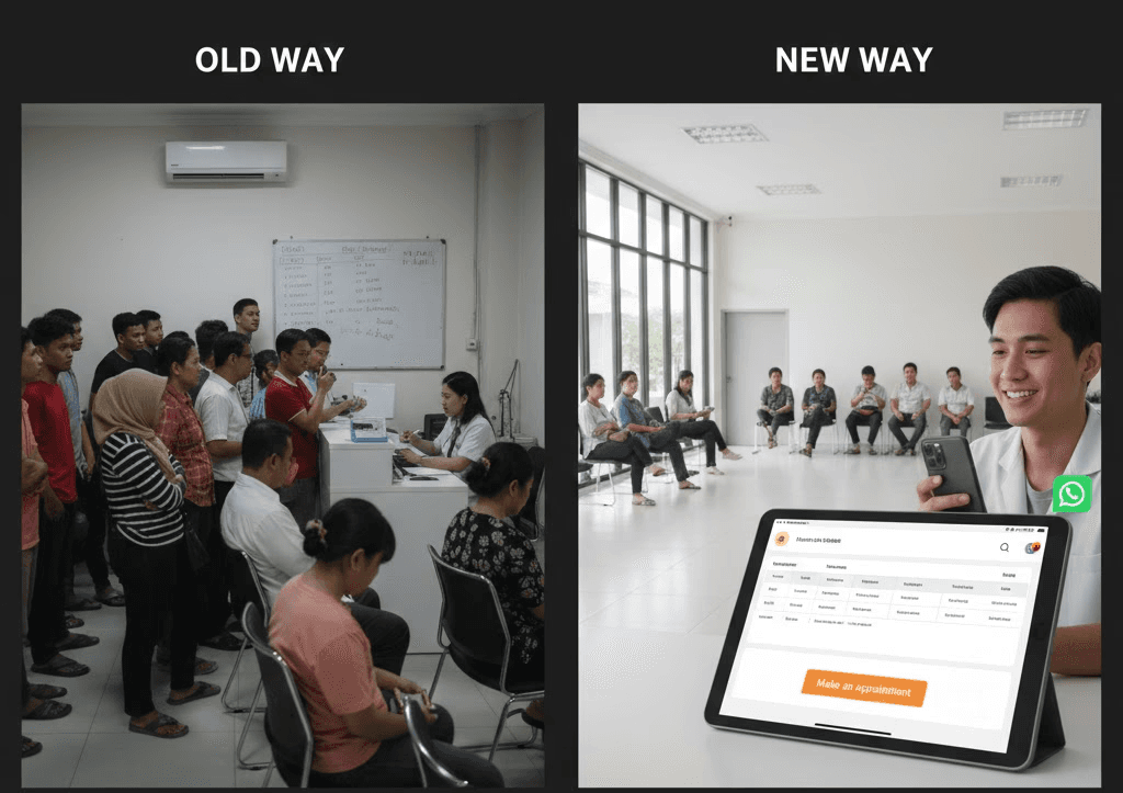
A local clinic faced severe operational bottlenecks due to an outdated manual registration system. Patients were forced to endure long physical queues or busy phone lines just to secure an appointment. This friction led to daily lobby congestion and a significant decline in patient satisfaction.
Key Issues:
Fragmented doctor schedules that were inaccessible to patients.
Information gaps regarding operating hours and clinic locations.
Lack of an autonomous booking system, forcing heavy manual intervention from staff.
challenge.
The primary challenge was designing for a split demographic. I had to balance the speed expected by younger users with the high legibility required by senior patients aged 30 to 50 plus.
The Design Process:
User Research: Conducted interviews to identify why patients dropped off during the inquiry phase.
Ideation: Tested multiple layouts to find the best balance between trust and speed.
Rapid Prototyping: Refined the booking flow after testing showed that users felt overwhelmed by dense doctor lists.
Accessibility Iteration: Enlarged CTA buttons and implemented high-contrast color-coding based on senior user feedback.

results.
The digital transformation successfully created an "Information first" journey that builds user confidence before driving them toward booking. By implementing a clear hierarchy and high contrast actions, the solution delivered immediate measurable impact.
Project Achievements:
60% increase in online reservations within the first 14 days of launch.
Average on-site wait times decreased by 15 to 20 minutes per patient.
Significant reduction in repetitive phone inquiries for clinic staff.
Seamless accessibility across devices through a mobile-first responsive approach.